When we meet with potential new clients, we’re always completely honest and upfront about who we are and everything we do; it’s what wins us new business. Well, that and the quality of our existing work, not to forget referrals from our many great clients.
We never sell services that we’re not up to speed with, we don’t say ‘yes’ and figure it out later, and we don’t do anything that we feel is not going to benefit the client or their users. We specialise in the design and build of websites, we’ve been doing it a long time, and we know that we’re good at it.
During initial meetings with potential new customers, more often than not, we’ll be asked:
“What are you going to do to make our website ‘different’ from everyone else’s?”
The simple answer to this is that we’re not. In this situation, we can get some funny looks, and I’m sure that sometimes it loses us work.
But let me explain why. When a client asks for ‘different’ most of the time, they’re asking for something unusual. They want their site to be different at all costs. Recently we heard:
“Maybe the navigation could be a button somewhere on the page that when clicked pops up a circular wheel of buttons.”
I kid you not.
At this point, we explain that users are used to navigating websites using traditional methods – usually by clicking a row of links at the top of a page or a list down the side. As dull as this may sound, a user should not be made to hunt for navigation or seek out menus to get around your website; navigation should be clearly sign-posted from the off. We aim to make our sites as user friendly as possible; we don’t use gimmicks or try to be ‘different’ for the sake of it. It’s in our interest to get your users to your content as quickly as possible because this will benefit the success of your website, which will, in turn, benefit us.
People like to believe that their users will spend hours reading through their site, enjoying the feast of information on offer. However, in today’s fast-paced world, users don’t want an ‘immersive online experience’; they’re not playing a game – they want to use your site to get to relevant content as quickly as possible. They want the overall experience to be one of:
“That was easy – now on to my next job.”
And not:
“Wow this website looks great, it’s so different – how do I use it?”
The reason is that they won’t. They’ll move on to the next site to find what they’re looking for quicker.
Being ‘different’ is great – write better content, display better imagery and design your site with the polish and finesse that your competitors lack, but don’t lose sight of your website’s purpose. Your website should say the right things – it should get the user to the information they’re looking for quickly and easily.
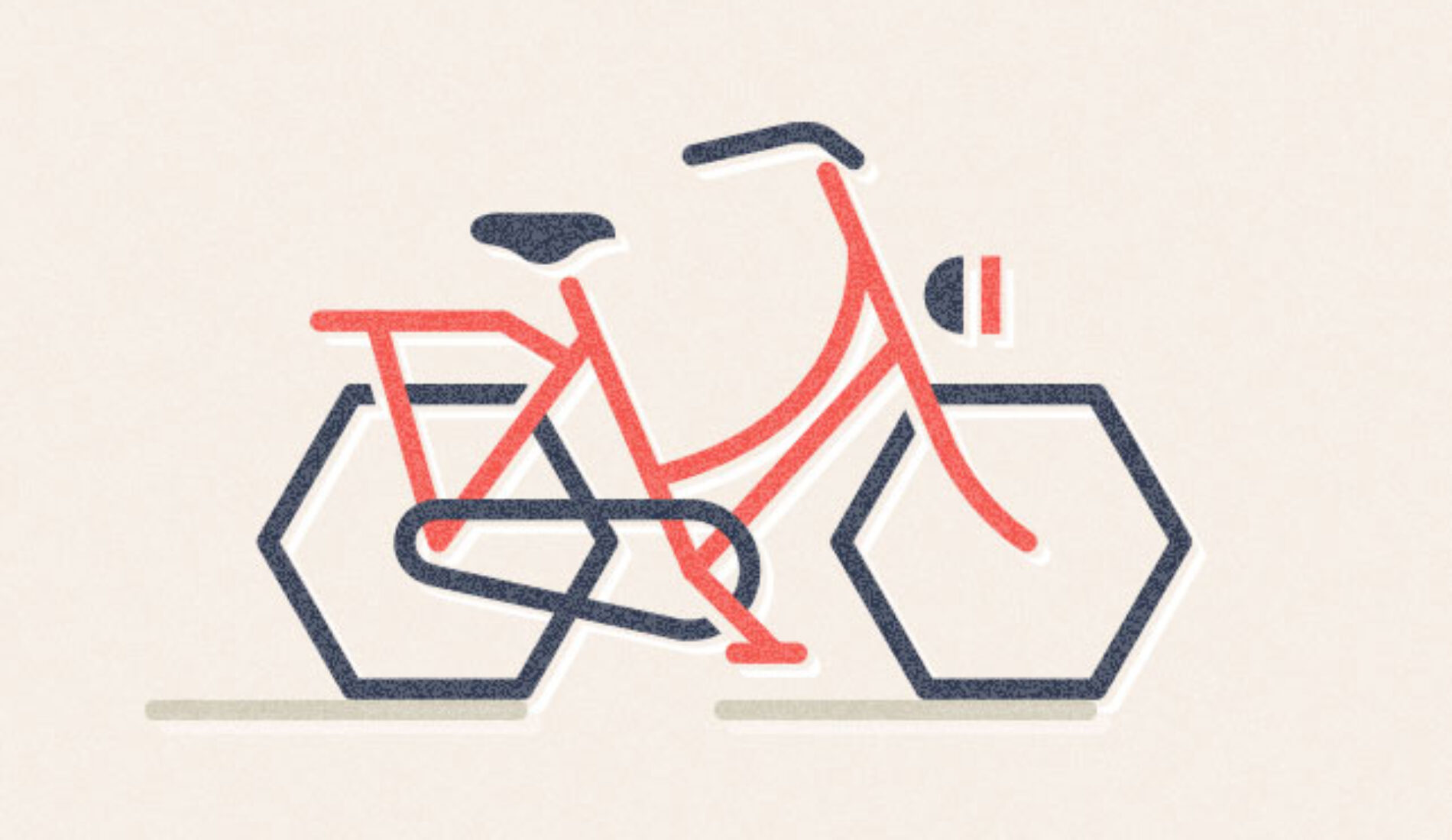
We understand that you want your website to stand out. That’s why we design your site to echo your brand, product, service and values. Yours and nobody else’s. It’s those things that should stand out as being different or better. Your website should be designed to convey that information in the simplest possible way. Your site should feel familiar. Users should instinctively know how to use it and not be made to think about how to get around it. Changing how your users browse your website is like reinventing the wheel. It’ll only lead to unnecessary confusion.
As technologies change and websites evolve to meet the demands of our ever-growing number of web-enabled devices, we will undoubtedly browse the web differently. That said, the basic principles of any great website will continue to remain – publish great content and make it easily discoverable through tried and tested methods. Consider what’s important and try not to reinvent the wheel by unnecessarily redoing work that has already been done for you.


