
Your customers don’t wait until they reach a desk to judge your business. They are comparing, researching and buying from phones, tablets, laptops and screens while they are on the move. If your website makes any of those people pinch, zoom, hunt or wait, it’s not just a design problem. It’s a commercial leak. Responsive website design closes that gap by giving every visitor a consistent user experience, regardless of the device they use.
That does not mean shrinking a desktop website until it technically fits on a mobile. A genuinely responsive experience changes intelligently with the available space. Navigation becomes easier to use, content falls into a sensible order, type remains readable and important actions stay visible. Done well, the website feels designed for the visitor rather than adapted as an afterthought.
At Fhoke, we approach responsive design from the perspective of over 18 years as an agency, and our founders have worked in agencies since 2000, so we genuinely have! We are a UK-based web design agency in London and a pretty damn good WordPress agency at that, but our clients and audiences stretch across every corner of the world. That breadth has taught us one reliable lesson: good responsive design begins with people and business priorities, not breakpoints.
This Article Will Cover:
What responsive website design really means
A responsive website uses a flexible layout that responds to the width and capabilities of the visitor’s screen. Instead of creating a single fixed page for desktop and a separate page for mobile (although that was a thing back in the day), designers and developers build a shared system. Grids can contract or expand, images can scale, columns can stack, and controls can change position when space becomes limited.
The important word is not “flexible”; it is “intentional”. A three-column service grid may become a single column on a phone, but the order of those services still matters. A large navigation menu may collapse into a compact hamburger menu, but visitors must still understand where it is and how to use it. A cinematic image may be cropped more tightly, but its subject should not disappear behind text. Responsive design is the practice of making those decisions deliberately.
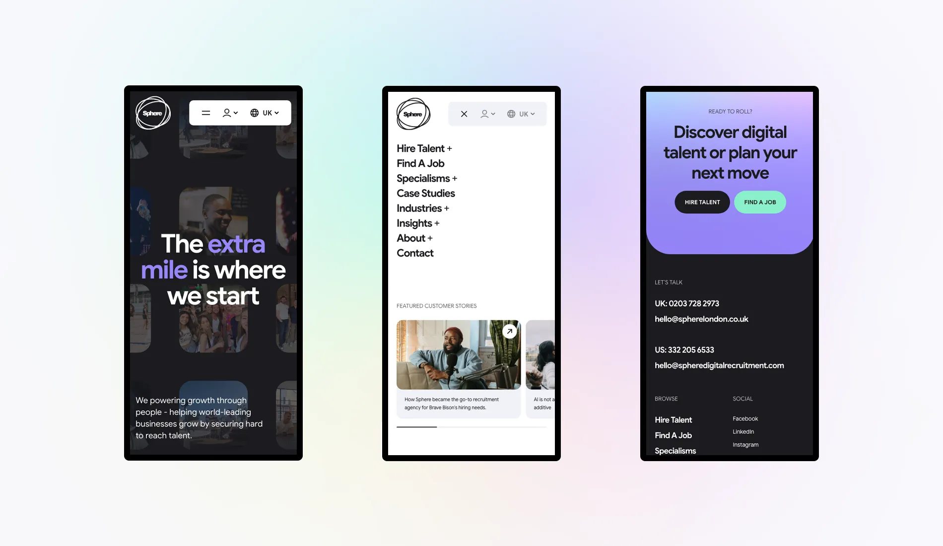
Why responsive design matters to the business
It protects the first impression
People form opinions quickly. A page that spills beyond the screen, loads an oversized image or hides the main call to action makes the business feel less considered. People judge. People are subjective, and the visitor won’t distinguish between the website and the organisation behind it. As soon as they land on the website, they are experiencing one brand. A calm, legible and purposeful mobile layout signals that you understand their needs before a conversation has even begun.
It removes friction from conversion
Responsive design supports conversion by making action easier. Forms can use suitable input types, buttons can be large enough to tap, and checkout steps can avoid unnecessary complexity. Telephone numbers can serve as useful contact points. Pricing tables can be reorganised so that comparisons remain understandable. None of these choices is flashy, but together they reduce the small frustrations that cause people to leave.
It supports search visibility
Search engines want to direct people towards pages that work well for them. In fact, they prioritise mobile these days. A mobile-friendly layout, sensible content structure and good performance scores all contribute to a better experience. Responsive design is not a magic ranking switch, and it won’t compensate for poor content or a confused site structure. It is a foundation to give valuable content the best chance to perform.
It makes marketing more dependable
Marketing teams rarely control the device used after someone clicks an advert, an email, or a social post. A campaign might look great on social channels, but the landing page could be cramped and its form unusable. Responsive landing pages should create continuity between message and experience. That helps marketing managers assess the quality of the campaign rather than wondering whether the website itself damaged the result.

The limitations are real, but manageable
Responsive work requires extra thought. Designers need to consider more states, developers need to build flexible behaviour, and testers need to check a meaningful range of screens. Complex desktop interactions may need to be simplified or reconsidered. Images and video require careful handling so their impact doesn’t come at the cost of speed.
Some teams worry that responsive design inevitably produces a less flashy website. It can, in part, particularly when the project relies on fancy components. But responsiveness does not dilute the site into blandville. Strong typography, art direction, animation, illustration and distinctive layouts can all work across screens. The goal is to create a design language with enough flexibility to stay recognisable without forcing every screen into the same layout.
How to plan a responsive website properly
1. Start with user priorities
Begin with the goals your site’s visitors need to reach. A founder may want people to understand a new proposition. A service business may depend on enquiries. An eCommerce team may need shoppers to quickly find and compare products. Those priorities should define the hierarchy on every screen. Do not assume the desktop order is automatically correct for mobile.
2. Design a system, not a collection of pages
Reusable components make responsive behaviour predictable. Define how cards, testimonials, calls to action, forms, tables, media and navigation respond when space changes. In WordPress, a well-designed block system allows editors to assemble new pages without breaking that behaviour. This is where an experienced WordPress agency can add real value: the editing experience and the public-facing design should support one another.
3. Treat content as part of the design
A flexible grid cannot rescue crappy content. Use meaningful headings, contextual links, labels, and paragraphs that make their point without unnecessary re-reads. If a layout only works with exactly twelve words, it’s probably time you go back to the drawing board. Design with flexibility so the UI can handle the real-world once a client gets their hands on it. You may have designed something for three words; they may want to use eight.
4. Make performance a design requirement
Mobile visitors may be using a slower connection or a less powerful device. Although that’s less likely these days, still, compress images; use WebP; serve appropriate image sizes; avoid unnecessary scripts; and be selective with animation. Good performance is not a final technical tidy-up. It affects creative choices from the beginning. A beautiful hero that delays the page’s main message is not doing its job.
5. Test real journeys
Checking a homepage at three preset widths is not enough. Test navigation, search, forms, account areas, filters, tables, downloads and checkout flows. Rotate devices. Increase the text size. Use a keyboard. Check long names and unexpected content. Analytics can identify where problems occur, while direct observation can reveal why. The most valuable test is often a complete task performed under realistic conditions.
Common responsive design mistakes
- Hiding useful content on mobile: smaller screens require prioritisation, but mobile visitors should still see the same content.
- Using device labels as the whole strategy: design for the space and content rather than chasing a list of popular phone models.
- Making tap targets too small: links and controls need comfortable spacing, especially in menus and forms.
- Ignoring wide and uncommon screen sizes: layouts can fail between the familiar mobile, tablet and desktop checkpoints.
- Letting tables overflow without a plan: simplify, scroll, stack or reframe data according to what the reader needs to compare.
Is it time to redesign your website?
If your existing site performs poorly on smaller screens, the right solution depends on its foundations. A focused improvement may be possible when the content structure and code are sound. In other cases, adding responsive patches to an ageing theme creates more issues than it’s sometimes worth. A redesign can be an opportunity to clarify the proposition, simplify journeys, improve accessibility, and establish a content system that the team can use with confidence.
Look beyond appearance when making that decision. Review mobile enquiry quality, form completion, ecommerce behaviour, page speed, search performance and the effort required to publish. Speak to the people who manage the website as well as those who approve it. A visually acceptable site can still be expensive behind the scenes if routine changes require a developer stepping in every time or introduce inconsistent layouts.
A responsive website should feel effortless
The best responsive design rarely calls attention to itself. Visitors simply find the information they need, understand the offer and take the next step. The menu makes sense, the page loads quickly, the text is readable, and the important call to action appears at the right moment.
For tech-savvy founders, that means a flexible platform that can grow with the product. For small business owners, it means fewer missed opportunities and a website that accurately represents the company. For marketing managers, it means campaigns landing on an experience that supports the promise. The details differ, but the standard should not: every visitor deserves a website that works beautifully on the screen in front of them.
As a London web design agency working with brands around the world, Fhoke combines years of design experience and technical know-how to build responsive websites with purpose. Whether WordPress is the right platform or another solution fits the brief, the starting point is the same: understand the audience, remove the friction and make every screen count.


