
A strong travel website should help people move from inspiration to confidence and then to an enquiry or booking. That means combining destination storytelling with structured trip information, intuitive discovery, clear itineraries, trust signals, a mobile-friendly user experience and the right booking or CRM integrations. The exact feature list should follow the operator’s commercial goals, not a half-baked generic travel template.
Travel websites have two jobs: inspire and remove uncertainty
Travel is unusually emotional and unusually practical. A visitor may arrive because a photograph, destination or experience captures their imagination, but they still need enough detail to decide whether the trip is right for them. Dates, duration, itinerary, inclusions, accommodation, activity level, availability, pricing or enquiry information all have to work alongside the story.
That is why a good travel website is not just a beautiful online brochure and not simply a booking engine. It needs to connect discovery, comparison, reassurance and action.
The essential travel website feature set
| Feature | What it should help the traveller do | Why it matters |
| Destination and trip architecture | Browse by destination, travel style, dates or interests | Makes a large catalogue understandable |
| Structured trip pages | Understand itinerary, duration, inclusions, suitability and next steps | Turns inspiration into confidence |
| Search and filtering | Narrow a large choice set quickly | Reduces browsing friction |
| Strong imagery and editorial | Imagine the experience | Travel decisions are emotional as well as functional |
| Trust content | Assess expertise, reviews, guides and practical information | Reduces perceived risk |
| Clear enquiry / booking route | Know exactly what happens next | Prevents high-intent visitors getting lost |
| Responsive UX | Research and act comfortably on mobile | Travel research happens across devices |
| CMS | Create destinations, trips, campaigns and editorial efficiently | Keeps the site current as the offer changes |
| Booking / CRM integration | Connect the website to operational systems where needed | Avoids fragmented customer journeys |
| SEO-ready content structure | Create useful destination and trip landing pages | Supports non-branded discovery |

1. A destination structure that matches how people actually browse
Don’t organise the public website around an internal spreadsheet. Travellers may think in countries, regions, travel styles, activities, seasons, durations or levels of challenge. The website needs a content model that can connect those dimensions without creating a maze of duplicate pages.
Fhoke’s work with Pioneer Expeditions is a great example of that. Existing itineraries were migrated into a more scalable structure, and visitors can browse from tailor-made travel and escorted small groups through to specialist adventures. The underlying lesson is that content architecture is part of the product experience, not CMS housekeeping.
2. Trip pages that answer the questions holding back a decision
A great-looking trip page can still be tripped up by a lack of visible, key information travellers need to know. Take a step back during planning and ask:
- Who is this trip for?
- What will I actually do and see?
- How long does it last?
- What is included and excluded?
- What level of fitness, experience or preparation is required?
- When can I travel?
- What does it cost, or how do I get a quote?
- What happens after I enquire or book?
The answers will differ between a tailor-made operator, expedition company, hotel, event-hospitality business and fixed-departure tour operator. The page template should reflect that difference.
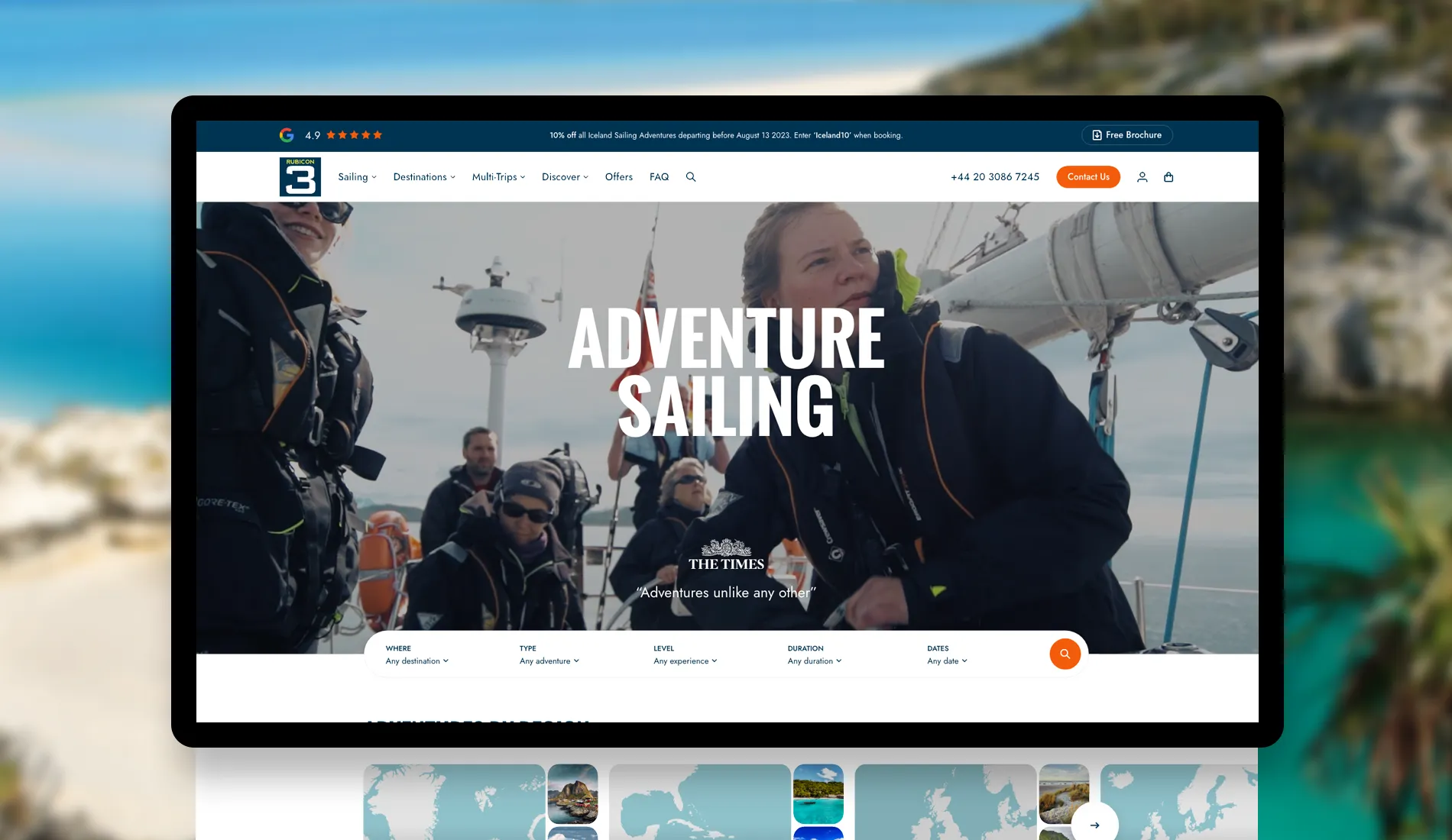
3. Search and filtering when the catalogue becomes complex
An onsite search tool isn’t automatically necessary for a small, curated travel business. But once an operator has many destinations, departure dates or experience types, structured filtering can become essential.
Rubicon 3 Adventure is a great example of why you might need one. Built by us (Fhoke), the site lets visitors explore expeditions by destination, adventure type, sailing experience, duration and travel dates. That makes complex inventory easier to understand without flattening every trip into the same generic card.
4. A booking model that matches the way the business sells
| Commercial model | Likely primary action | Website implication |
| Tailor-made travel | Enquire/request a proposal | Rich trip content, qualification forms, CRM handoff |
| Fixed-departure tours | Check dates/book/enquire | Departure data, availability and booking integration |
| Experience-led ecommerce | Select and transact | Commerce, payments, availability, upsells |
| Complex bespoke travel | Plan /enquire/manage booking | Potential CRM, portal or bespoke application layer |
Pioneer Expeditions is primarily designed to move visitors from inspiration to enquiry. The Pop-Up Hotel booking website is different: Fhoke built custom WooCommerce booking functionality supporting destinations, room options, upsells, deposits, staggered payments and reporting. The technology follows the transaction model.
5. Booking systems and CRM integrations should feel native
A travel website may need to connect with a booking engine, CRM, availability source, payment platform or custom travel API. The technical approach may be an API, feed, widget, embed or bespoke application. That choice should be understood before the planning phase is finalised.
The customer shouldn’t have to understand the systems architecture (what goes on behind the scenes). But the transition from destination discovery to enquiry or booking should feel like one journey, even when several systems sit behind it.

6. A CMS built around repeatable travel content
Travel teams constantly add and update destinations, itineraries, seasonal campaigns, departure information, editorial and imagery. The CMS should support those as reusable content types instead of forcing editors to rebuild layouts manually, every time!
For Pioneer, Fhoke replaced a patchwork of themes, plugins and third-party tools with a bespoke WordPress theme and setup and migrated existing itineraries into a more sustainable content system. The benefit was not WordPress for its own sake; it was giving the team a structure that could grow with the offer.
7. Mobile UX without sacrificing the emotional impact
Large photography and video can make travel content compelling, but they can also make pages slow and difficult to use. On mobile, itinerary hierarchy, filters, forms and booking actions matter just as much as the hero image. Design and performance need to be solved together.
8. Trust should be designed into the journey
As in any walk of life, trust wins. That’s why it should never be an afterthought. Besides, Google loves a bit of helpful content, and these rules are items it gobbles up for breakfast:
- Clear information about the operator and people behind the trips
- Customer reviews or testimonials where appropriate
- Practical travel information and FAQs
- Transparent inclusions, exclusions and next steps
- Professional photography and accurate destination content
- Clear contact routes for questions before commitment
There is no single ‘travel website’ template
Across Pioneer Expeditions, Rubicon 3 Adventure, Yukon 1000 and The Pop-Up Hotel, the content and transaction models are materially different.
Pioneer needs scalable destination and itinerary discovery; Rubicon needs detailed expedition filtering; Yukon promotes a specialist annual event; The Pop-Up Hotel needs a transactional accommodation and hospitality experience.
The common theme is to design around the traveller and commercial model rather than forcing all four into the same travel-industry template.
Fhoke’s view
Start with the traveller journey, not a feature checklist. Decide how people discover the offer, what information they need before they trust it, and whether the natural next step is an enquiry, a booking or a more complex planning process. Only then choose the CMS, booking technology and integrations.
The best travel website makes a complicated decision feel simple without feeling generic.
Travel website checklist
- Define destinations, trip types and traveller audiences before designing navigation.
- Create structured templates for destinations, trips and itineraries.
- Decide whether search/filtering genuinely improves discovery.
- Make the enquiry or booking route obvious on every high-intent page.
- Map booking, CRM, payment and API requirements before finalising UX.
- Design mobile trip pages around scannability and action, not just imagery.
- Give editors reusable content structures for new trips and campaigns.
- Plan SEO URLs, metadata, internal linking and structured content from the start.
- Build trust through people, expertise, reviews and practical information.
- Measure enquiries, booking starts and completed bookings—not just page views.
FAQs
Does every travel website need online booking?
No. Tailor-made and high-consideration travel businesses may convert more naturally through an enquiry or consultation. Online booking makes more sense when the product, dates, availability and pricing can be selected confidently without a planning conversation.
Should a tour operator website have search and filters?
If the catalogue is large or multidimensional, usually yes. Filters should reflect how travellers choose—such as destination, date, duration, experience type or ability level—rather than exposing internal taxonomy.
Can WordPress integrate with a travel booking system?
Yes, provided the booking platform offers a suitable API, feed, widget or embed route. The integration method should be assessed early because it can affect UX, data flow and technical scope.
What is the most important travel website feature?
There is no universal single feature. The most important capability is a clear journey from discovery to a confident next step, supported by the right trip information and technology for the operator’s business model.


