A website redesign should do far more than give your business a new look. Done properly, it can sharpen your positioning, improve the customer journey, generate better leads and create a platform that supports years of growth. Some of the sites we’ve built have lasted 8+ years, and they’re still going strong. That’s some genuine return on the investment right there!
But. Done badly, it can become an expensive exercise in moving the same problems into a smarter-looking layout.
The difference usually comes down to what happens before the first polished design is presented. Clear objectives, user research, content planning, technical prep and disciplined testing are not obstacles to creativity. They are what allow creativity to produce a commercially effective website.
Having designed and developed websites for ambitious organisations across education, professional services, travel, eCommerce and technology, we see the same avoidable issues surface again and again. Here are ten mistakes to avoid when redesigning your website.
This Article Will Cover:
- What To Know
- 1. Starting With Visual Design Instead of Strategy
- 2. Redesigning Without Understanding Your Users
- 3. Treating the Redesign as a Cosmetic Exercise
- 4. Copying Competitors Instead of Creating a Distinct Position
- 5. Leaving Content Until the End
- 6. Forgetting About SEO During the Redesign
- 7. Designing for Desktop and Adapting for Mobile Later
- 8. Adding Features Without Questioning Their Value
- 9. Choosing a Platform for Convenience Rather Than Fit
- 10. Rushing Testing, Migration and Launch
- How to Make Your Website Redesign a Success
- Is It Time to Rethink Your Website?
What To Know
- A successful website redesign starts with strategy, user research and clear business goals—not visual design alone.
- Protect your investment by planning content, SEO, mobile responsiveness and site architecture before development begins.
- Focus on creating a user experience that is intuitive, fast and conversion-driven, rather than simply copying competitors or adding unnecessary features.
- Thorough testing, stakeholder collaboration and ongoing optimisation after launch are essential to ensuring long-term website performance and business growth.
1. Starting With Visual Design Instead of Strategy
It is tempting to begin a redesign by discussing colours, typography, animation and homepage concepts. Those are important decisions, but they should not be the first ones.
Before anybody starts designing screens, the project needs a clear commercial purpose. Are you trying to increase qualified enquiries? Sell more products? Enter a new market? Reposition the brand? Improve recruitment? Give your internal team more control?
Without agreed objectives, subjective opinions begin to drive the project. Stakeholders debate what they personally like, rather than what will help the business and its customers.
A proper planning stage should establish:
- The business goals the website must support
- The audiences it needs to serve
- The weaknesses of the current website
- The actions visitors should be encouraged to take
- The features, integrations and content required
- How success will be measured after launch
Our web design process starts with strategy because decisions made at this stage influence everything that follows, from site architecture and copywriting to platform selection and development.
2. Redesigning Without Understanding Your Users
Your website is not just for your internal team to fawn over. It is for the people trying to understand, compare, trust, buy from or contact your organisation.
A redesign based entirely on internal assumptions can easily prioritise the wrong information. Teams close to a business often understand its language, structure and services so well that they underestimate how confusing these things may be to somebody arriving for the first time.
User research does not always need to become a months-long programme. Useful evidence can come from:
- Analytics and search data
- Customer interviews or surveys
- Sales and support team feedback
- Session recordings and heatmaps
- Common questions raised during enquiries
- Usability testing on the existing website
- Reviews of competitor websites
This research can then inform audience personas and practical user journeys. A returning customer may need something very different from a first-time prospect. A parent researching a school will have different priorities from a hotel guest preparing to book an event package.
Understanding these differences helps create an experience that answers the right questions in the right order.
3. Treating the Redesign as a Cosmetic Exercise
A new visual identity can transform how a business is seen, but appearance alone will not solve weak navigation, unclear positioning, poor performance or a frustrating conversion journey.
This is one of the most common website redesign mistakes: replacing the surface while leaving the underlying structure untouched.
Before carrying old pages into a new design, question whether they still deserve to exist. Review the content hierarchy, navigation, functionality, customer journeys and technology behind the website. Remove duplication. Consolidate weak pages. Give critical content more importance.
As we explore in When Great Design Fails: The Hidden Cost of Poor UX, strong visuals may attract attention, but the experience underneath defines whether users continue, convert or leave.
4. Copying Competitors Instead of Creating a Distinct Position
Competitor analysis is useful. Competitor imitation is not.
Looking at other organisations can reveal common customer expectations, content gaps and opportunities to improve. Problems begin when every decision is justified with “our competitors do it this way”.
Following the category too closely often creates a website that looks interchangeable with everybody else. The familiar industry colours appear. The same stock imagery returns. The same vague claims sit beneath the same predictable page layouts.
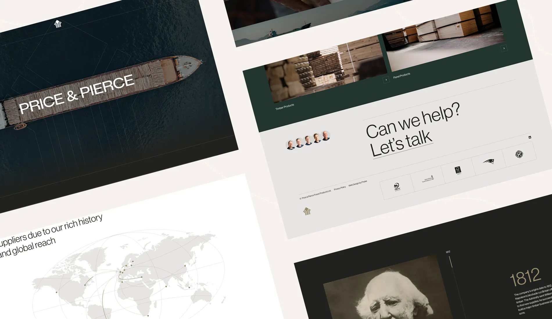
Project example: Price & Pierce
When redesigning the website for Price & Pierce, we deliberately moved away from the dated, overly corporate style often associated with the timber sector.
An editorial-inspired visual direction, large-format imagery, purposeful typography and concise messaging allowed the business to communicate more than 150 years of heritage without appearing stuck in the past. The result balanced authority with a more modern and confident position, earning an Awwwards Honourable Mention and CSS Design Awards Website of the Day.
The goal is not to ignore the conventions of your sector. It is to understand which ones help users and which ones prevent your brand from being remembered.
5. Leaving Content Until the End
Content is one of the most frequently underestimated parts of a website redesign.
When copy is delayed, designers are forced to work with placeholder text and unrealistic assumptions about content length. The finished words are then squeezed into layouts that were not designed for them, leading to bloated pages, weak hierarchy and last-minute compromises.
Content planning should begin alongside UX and site architecture. Each important page needs a clear purpose, audience and ultimate action.
Good website content should quickly explain:
- What the organisation does
- Who it helps
- Why its offer is different
- What evidence supports its claims
- What the visitor should do next
That does not mean filling every available space. Strong websites are selective. They prioritise useful information, make important messages easy to scan and create clear routes into deeper detail.
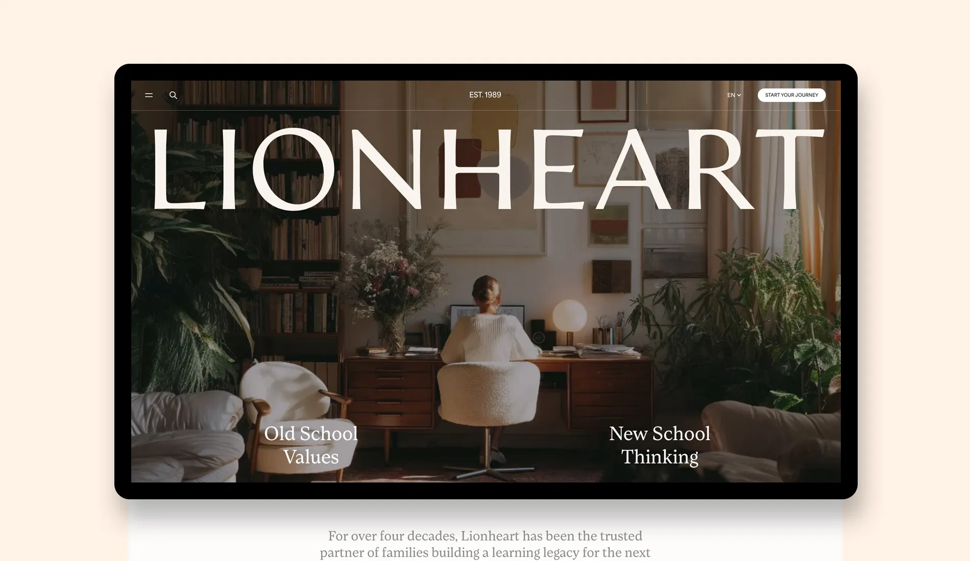
Project example: Lionheart Education
For Lionheart Education, carefully structured content was essential. Families needed to understand the school’s distinctive one-to-one model, develop confidence in its approach and move through the admissions journey without unnecessary uncertainty.
Spacious layouts and considered typography supported a content structure designed around trust, clarity and care. HubSpot integration helped capture and manage enquiries, while predictive search made important information easier for parents to find. The site received recognition from both CSS Design Awards and Awwwards.
6. Forgetting About SEO During the Redesign
A redesign can improve organic visibility, but it can also damage years of search performance if SEO is treated as a task to consider after launch.
Changing page URLs, deleting valuable content or altering site architecture without a migration plan can cause rankings and traffic to fall. Even when redirects are added, removing pages without understanding their search value can leave gaps that are difficult to recover.
SEO should influence the redesign from the planning stage. The process should include:
- An audit of current rankings, traffic and backlinks
- Keyword and search-intent research
- A review of high-performing landing pages
- Logical page hierarchy and internal linking
- Metadata and heading planning
- Technical crawling and indexing checks
- Structured data where appropriate
- A complete redirect map for changed URLs
The same content foundations are becoming increasingly important for AI-assisted discovery. Clear page relationships, useful answers, structured information and demonstrable expertise make it easier for both traditional search engines and emerging answer engines to interpret a website.
If you’re interested in learning what an audit might involve, check out our complete UX Audit Guide and find what’s driving customers away.
7. Designing for Desktop and Adapting for Mobile Later
Mobile responsiveness cannot be reduced to shrinking a desktop layout until it fits a smaller screen.
Mobile users may have different priorities, less time and less patience. Navigation needs to remain clear. Buttons must be easy to use. Forms should not become tedious. Typography must remain readable, and media should not overwhelm the connection or device.
Responsive behaviour should be considered throughout design and development, including:
- Navigation and menu behaviour
- Touch-target sizes
- Typography and spacing
- Image cropping
- Tables, filters and interactive tools
- Forms and checkout journeys
- Animation and video performance
- The order in which content appears
A design that only feels complete on a large studio monitor is not a complete website design.

Project example: The Pop-Up Hotel
The website for The Pop-Up Hotel needed to deliver an immersive sense of luxury while keeping destination discovery, room comparison and booking straightforward across devices.
Large-format photography and elegant layouts draw visitors into each event, but the experience remains focused on progressing from inspiration to reservation. Behind the interface, a bespoke WooCommerce booking system handles deposits, staggered payments, upsells and evolving accommodation packages. The project earned Special Kudos from CSS Design Awards.
8. Adding Features Without Questioning Their Value
Redesign projects often become feature wish lists. Everybody contributes an idea, and very few suggestions are removed.
The result can be a slower, harder-to-use website filled with functionality that sounds impressive in a meeting but delivers little value in practice.
Every proposed feature should have a clear reason to exist. Ask:
- Which user need does this solve?
- Which business objective does it support?
- How often will it be used?
- Who will maintain it?
- What impact could it have on speed, accessibility and security?
- Could a simpler solution achieve the same result?
This applies to visual features too. Animation should reinforce hierarchy, provide feedback or add appropriate character. It should not slow visitors down, hide essential information or make simple interactions feel like work.
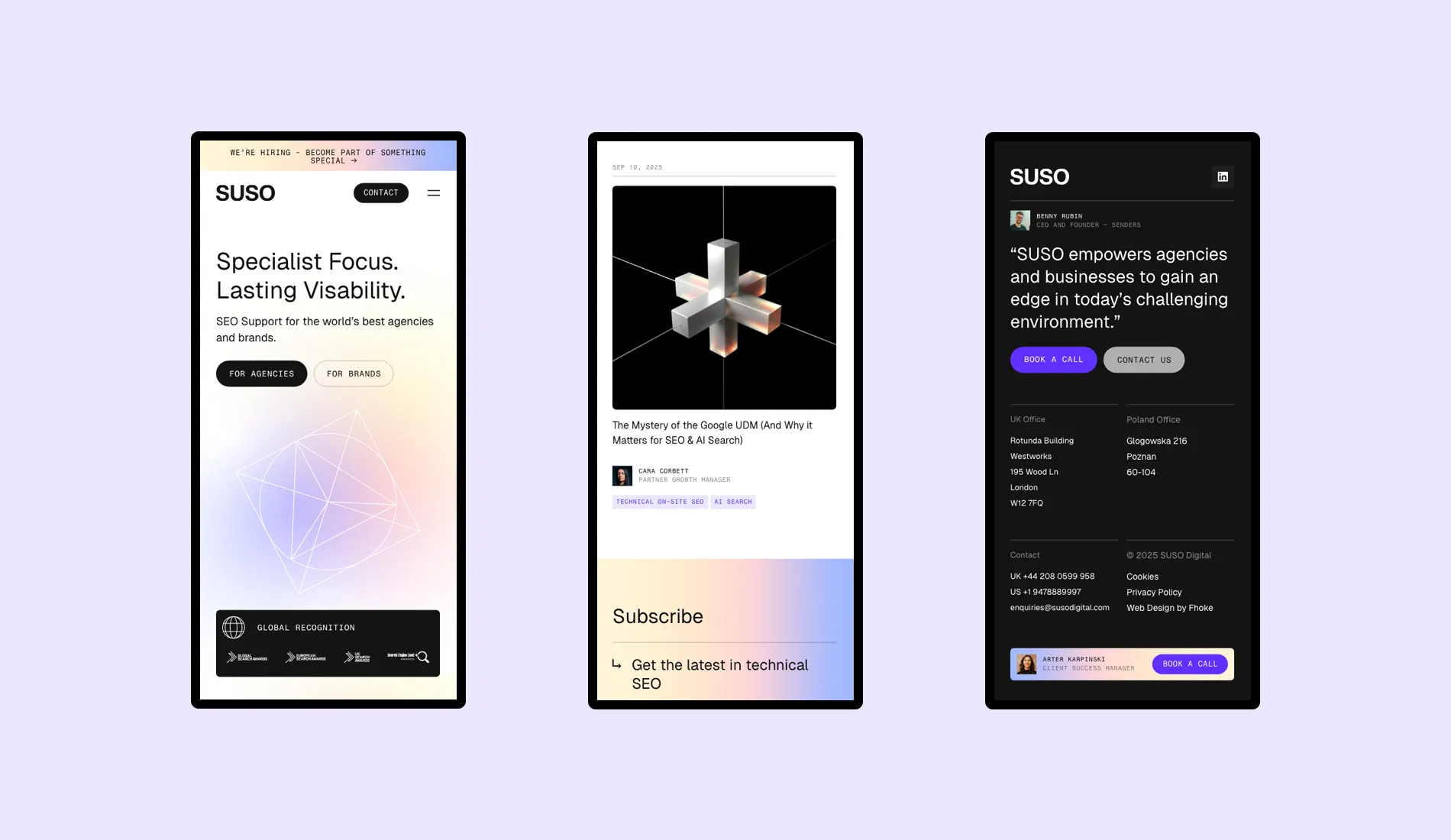
Project example: SUSO
For SEO and AI Search specialists SUSO, geometric shapes, purposeful transitions and bold layouts help express technical accuracy and momentum. They are not added as decoration alone.
The content structure guides users from high-level capabilities into services, evidence and case studies, while a modular ACF-powered WordPress system enables the internal team to build new pages consistently. Performance, schema and lead-generation requirements were considered as part of the build, which received an Awwwards Honourable Mention and CSS Design Awards Special Kudos.
9. Choosing a Platform for Convenience Rather Than Fit
The right content management system should support the organisation using it, not simply suit the preferences of the person selling or building the website.
A platform may look quick and inexpensive at the start but become restrictive as content, traffic, integrations or commercial requirements grow. Equally, an unnecessarily complicated system can create avoidable costs and make routine updates difficult.
Platform selection should consider:
- The type and volume of content
- Editorial workflows and user permissions
- eCommerce or booking requirements
- Third-party integrations
- International and multilingual needs
- Security and maintenance
- Performance expectations
- Future functionality
- The technical confidence of the internal team
For many organisations, a bespoke WordPress build offers an effective balance of flexibility, familiarity and control. A considered block system can allow marketing teams to create and adapt pages without sacrificing design consistency or filling the site with unnecessary page-builder code.
Our guide to ACF-powered bespoke WordPress themes explains how a structured approach can improve performance, scalability and the editing experience.
10. Rushing Testing, Migration and Launch
A website is not ready merely because the approved pages have been built.
Before launch, it needs to be tested with real content, real devices and realistic user journeys. Forms must reach the right people. Integrations need to pass data correctly. Redirects must be checked. Editors need to understand the CMS. Analytics should be collecting meaningful information from day one.
A thorough quality-assurance process should cover:
- Current browsers and representative devices
- Responsive layouts and touch interactions
- Forms, checkouts and confirmation messages
- Navigation, search and filtering
- Page speed and image optimisation
- Accessibility fundamentals
- Metadata, canonical tags and indexing settings
- Redirects and broken links
- Analytics, consent and conversion tracking
- CMS workflows and staff training
- Backups, security and rollback planning
Launch should also be treated as a milestone rather than the end of the project. Once real visitors begin using the website, analytics and user feedback can reveal opportunities that were impossible to identify in a staging environment.
Plan time for post-launch monitoring, fixes and optimisation. A successful website should evolve alongside the business rather than remain untouched until the next redesign becomes unavoidable.
How to Make Your Website Redesign a Success
A successful redesign is not created by one dramatic idea. It is the result of many connected decisions being made with care.
Start by agreeing what the website needs to achieve. Research the people who will use it. Plan the content and journeys before polishing the interface. Bring SEO, mobile behaviour, accessibility and performance into the conversation early. Test the details properly, and give the website room to improve after launch.
Stakeholder involvement matters too, but it needs structure. Identify who can approve decisions, who holds important customer knowledge and who will manage the finished platform. Gather their input at the right stages rather than allowing late opinions to undo months of considered work.
Most importantly, choose a design and development partner that is willing to ask difficult questions before offering attractive answers. The best redesign process does not begin by showing you what your website could look like. It begins by understanding what your business and its users genuinely need.
Is It Time to Rethink Your Website?
Your website is not just another marketing deliverable. It is often the place where campaigns, recommendations, searches and first impressions converge. It should explain your value, build confidence and make the next step feel natural.
At Fhoke, we combine strategy, branding, user experience, design and bespoke development to create websites built around commercial goals rather than passing trends. You can explore more of our website design projects or read why we believe your website is a competitive edge.


