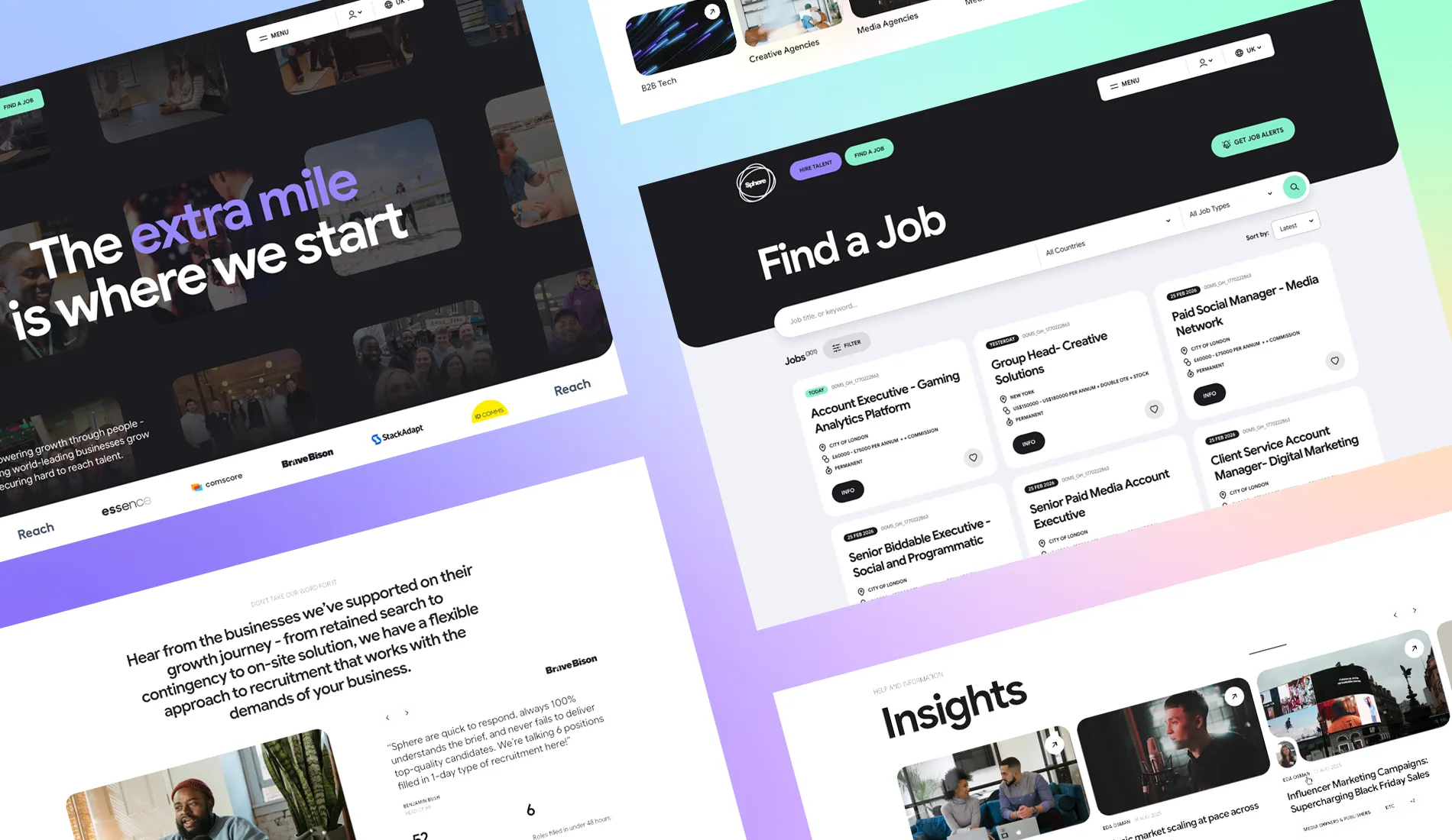
What does a recruitment website actually need to do in 2026? It sounds like a simple question. Show the jobs. Explain the business. Introduce the team. Give people a way to get in touch. But recruitment businesses have changed considerably, and the role their websites play has changed with them.
Our recent work with Sphere brought many of those changes into focus.
Sphere is a global recruitment business working across technology, consumer, media and agency markets. Over nearly two decades, they’ve built a business that spans multiple specialisms, industries, locations and ways of hiring — from permanent and freelance recruitment to project delivery and executive search.
Their positioning sums the business up nicely: Globally Connected. Personally Focused.
When we started working together on Sphere’s new website, the challenge wasn’t simply to make it look better. It was to create a digital platform capable of communicating everything the business had become without making it feel complicated.
And that’s a challenge we see across recruitment.
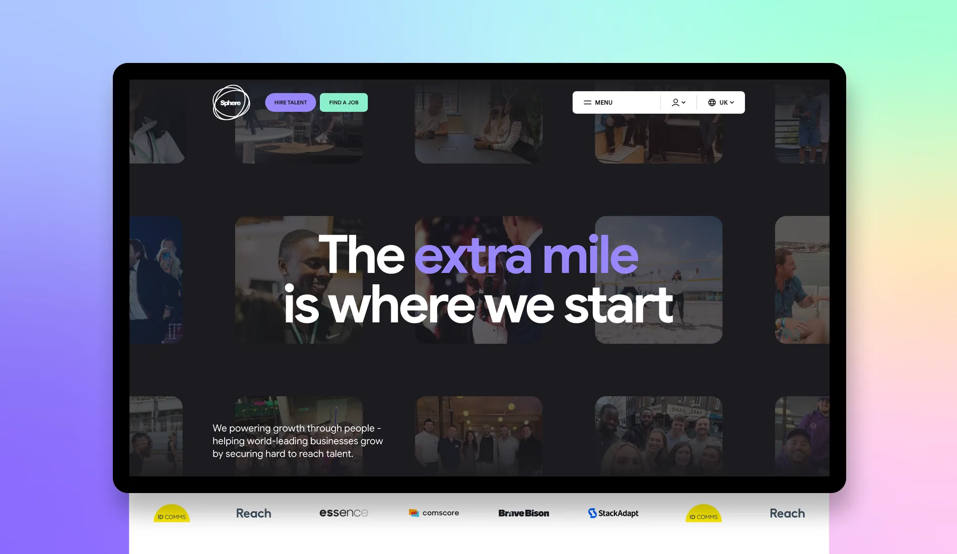
The recruitment website has grown up
There was a time when a recruitment website could essentially be a corporate website with a jobs board attached.
For many agencies, that model no longer works.
Recruitment businesses are becoming broader and more sophisticated. They operate across multiple sectors and territories. They offer different hiring models. They produce research and insight. They build specialist communities. They work with candidates at very different stages of their careers and clients ranging from growing start-ups to global businesses. The website has to accommodate all of it, and Sphere is a brilliant example.
The business works across media planning, social and influencer, marketing, creative and design, go-to-market, data, product and engineering, ecommerce, programmatic trading and ad ops. Phew! And alongside those specialisms sit distinct industry audiences, different hiring solutions, and an international presence spanning the UK, the US, Europe, and South Africa.
There’s a lot to communicate. So the answer isn’t to put more on the website. It’s to make what’s there easier to understand.
Start with the person, not the sitemap
One of the most useful things you can do at the beginning of a recruitment website project is forget about pages for a moment. Think about people instead.
Someone arriving on Sphere’s website looking for their next role has a fundamentally different objective from a business trying to build a team. That distinction informed the new experience.
“Hire Talent” and “Find a Job” aren’t simply calls to action. They’re two of the primary routes through the website, giving users an immediate way to identify the journey that’s relevant to them. From there, the experience can become more specific.
A client might want to understand Sphere’s hiring models, explore its industry expertise or see evidence of the businesses it has helped. A candidate is more likely to want vacancies, specialist areas and information that helps them make their next move.
It’s an important distinction because recruitment websites tend to be structured around how the recruitment business sees itself. In reality, the user doesn’t necessarily see things that way. They don’t need to understand your organisational structure to use your website.
Good information architecture removes that burden.
Complexity shouldn’t feel complicated
This became particularly important with Sphere because of the breadth of the business. There are services, industries, specialisms, jobs, insights, case studies, teams and international markets. All are important, but giving everything equal prominence would create a website that’s technically comprehensive and practically overwhelming.
Designing a large recruitment website therefore becomes an exercise in hierarchy.
- What needs to be understood immediately?
- What can be discovered later?
- Which areas naturally connect?
- Where does somebody need another route into the same content?
These decisions aren’t especially glamorous, but they’re fundamental to whether a website feels intuitive. The visual design then has a much clearer job to do. Rather than using design to decorate complexity, you can use typography, spacing, colour, imagery and interaction to reinforce an underlying structure that’s already clear.
The end result should feel simple even when what sits behind it isn’t.
Jobs need to belong to the experience
There’s another familiar problem with recruitment websites.
You spend time creating a carefully considered brand experience. The candidate clicks “Jobs” and suddenly it feels like they’ve left the website. Job boards and recruitment technology have traditionally been treated as functional necessities rather than part of the overall user experience. The result can be a disconnect between the marketing site and the part candidates are most likely to use. We wanted the opposite for Sphere.
Vacancies are part of the website, not an interruption to it. Candidates can explore roles, understand the essential information and move towards an application through an experience that feels consistent with the rest of the Sphere brand.
The technology behind a recruitment website is obviously important, but the candidate shouldn’t have to think about it. Whether vacancies originate from an ATS, CRM or job distribution platform is an implementation detail. What matters to the person using the website is whether they can find the right opportunity and apply without unnecessary friction.
Good recruitment technology should be powerful behind the scenes and almost invisible at the front.
Your website needs to sell more than jobs
Vacancies may attract candidates, but they’re only part of what a recruitment website needs to communicate. For prospective clients, the bigger question is expertise. Why should I trust this agency to find somebody important for my business? Recruitment is a crowded market and many businesses make very similar claims. They’re connected. Specialist. Experienced. People-focused. They know their markets. The website needs to turn those claims into something tangible.
For Sphere, that means giving proper space to both specialist disciplines and industry expertise. It’s an important difference. Understanding ecommerce recruitment isn’t simply about understanding a particular job title. Understanding media agencies isn’t the same as knowing how to recruit for a marketing role. Presenting both dimensions helps communicate the depth behind the business.
Case studies, insights, salary surveys and other useful content then add another layer of evidence. Instead of simply saying “we understand your market”, the business has opportunities to demonstrate it.
That’s where a recruitment website begins to move from a brochure to a business development tool.
A global business still needs to feel personal
Sphere’s positioning — Globally Connected. Personally Focused. — presented another interesting design challenge. Those ideas can easily pull in opposite directions.
Global recruitment businesses need to communicate scale, capability and credibility. But recruitment itself remains an intensely personal industry. Candidates are making career decisions. Businesses are trusting somebody to introduce people who could fundamentally change their team. Make the website too corporate, and you lose the human side of the business. Push personality too far, and you risk losing the confidence that comes with scale and experience.
The visual identity has to sit between the two.
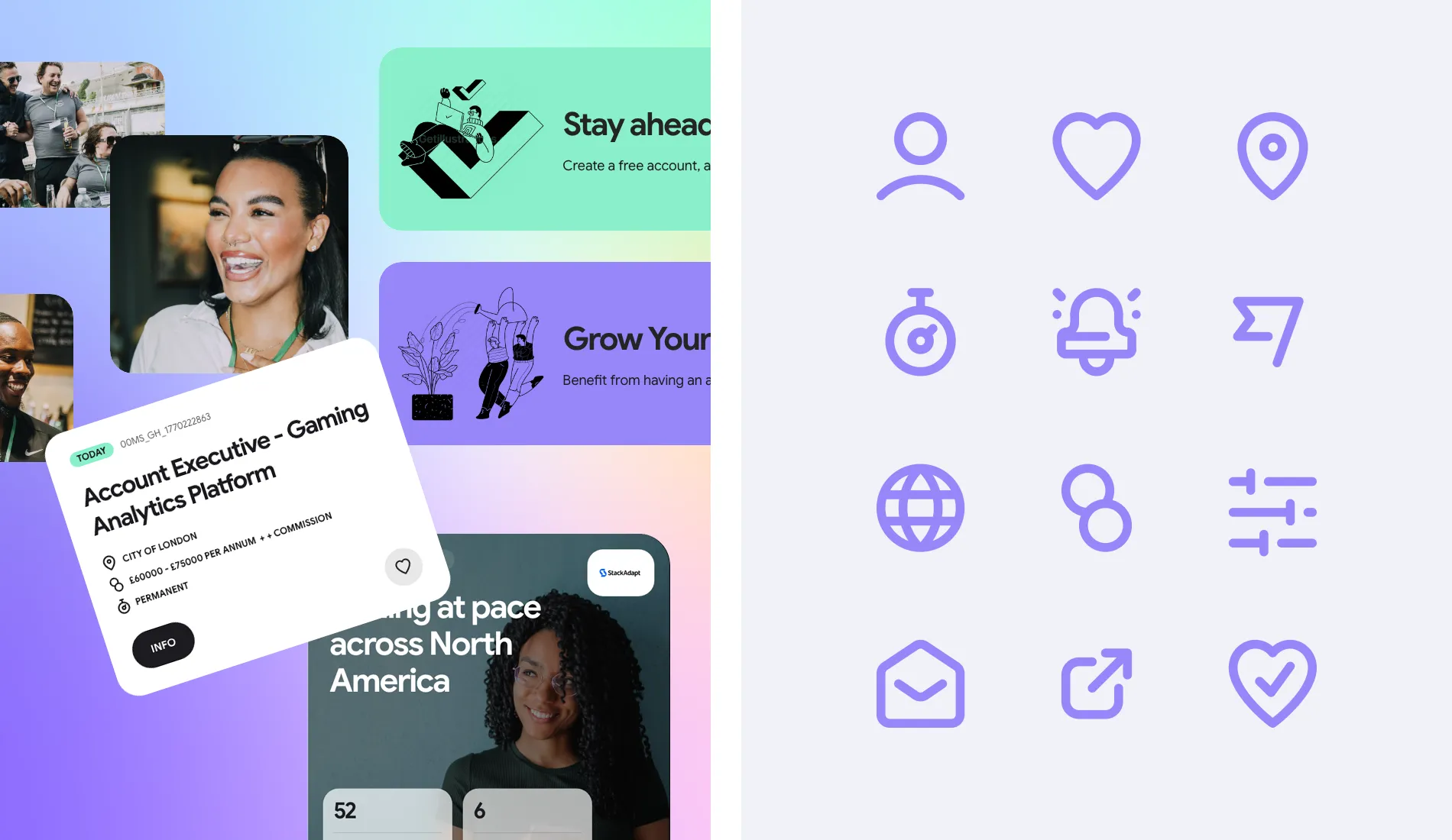
For Sphere, strong typography, confident messaging, imagery and a flexible visual system help create that balance. The website can feel established without feeling institutional, and energetic without becoming frivolous. It’s a useful principle for recruitment brands more generally.
Your website shouldn’t look like a recruitment website because that’s what recruitment websites are supposed to look like. It should look and feel like your business.
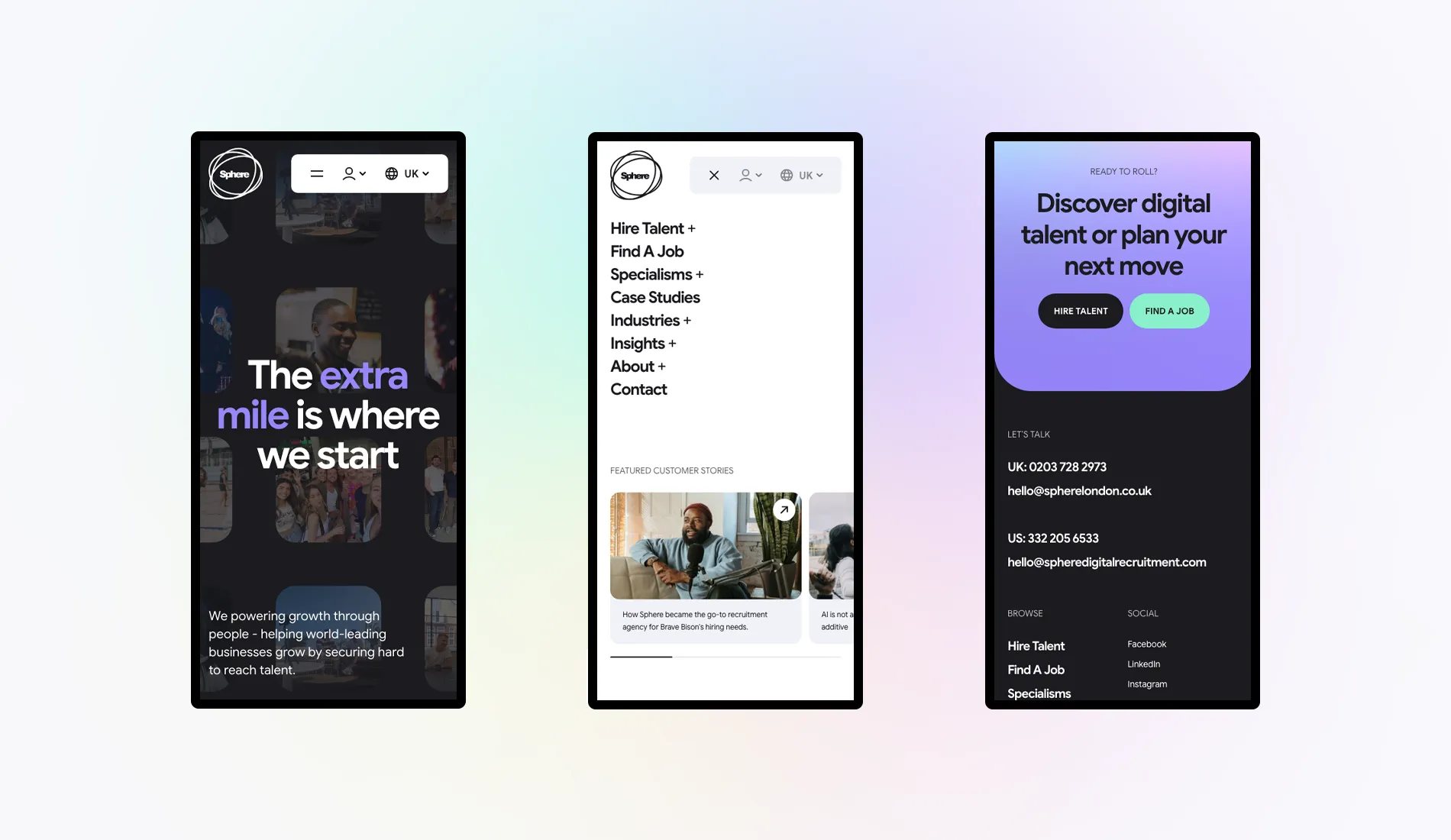
International doesn’t need to mean fragmented
Global growth raises another question: how do you create relevant experiences across different markets without adding complexity behind the scenes?
Sphere operates across the UK, US, Europe and South Africa. Those audiences aren’t identical. Jobs differ. Teams differ. Contact details differ. Certain content and priorities will naturally be more relevant in one territory than another. But the brand is still Sphere.
A scalable digital platform needs to accommodate those differences while retaining a coherent experience. That’s preferable to treating every new market as a reason to reinvent the website. The more a recruitment business grows, the more valuable that shared foundation becomes. Design remains consistent. Technology can be maintained centrally. New content can be created within an established system. Regional differences can be introduced where they actually add value.
Global on the outside doesn’t have to mean complicated on the inside.
The CMS matters more than most visitors will ever know
There’s also a side of website design that prospective candidates and clients never see. The CMS.
For a recruitment business, a website isn’t something that’s published and left alone. Jobs change constantly. Insights are published. New consultants join. Services evolve. New campaigns launch. Markets expand. The internal team needs to be able to respond. That’s why we favour bespoke WordPress themes with structured, reusable components rather than simply handing over an unrestricted page builder and hoping everything remains consistent.
There’s a balance to strike, and marketing teams need flexibility, but the website also needs rules.
A considered component system allows Sphere’s team to create and manage content across a large website without having to reinvent the design every time a page is published. That makes the website easier to manage today and more resilient tomorrow.

The best recruitment websites are platforms
Perhaps the biggest lesson from projects like Sphere is that “website redesign” doesn’t quite describe the job anymore. The design matters enormously, of course. But a modern recruitment website sits at the intersection of brand, content, recruitment technology, marketing and business development.
- It has to attract candidates.
- It has to convert clients.
- It has to communicate expertise.
- It has to publish vacancies.
- It has to showcase success.
- It has to support multiple audiences, teams and sometimes territories.
- And it has to give the people running it enough flexibility to keep evolving after the agency that built it has stepped away.
Thinking of it as a platform rather than a collection of pages changes the decisions you make.
- You stop asking what should go on the homepage and start asking what someone needs to accomplish.
- You stop thinking about a jobs feed as an integration and start thinking about the candidate experience.
- You stop adding pages for every part of the organisation and start creating journeys around the people the organisation serves.
- And you stop designing only for launch day.
What should your recruitment website do next?
That’s ultimately the question we think recruitment businesses should be asking. Not simply: does our website look dated? But: is it doing enough?
- Can candidates get from discovering you to discovering the right opportunity easily?
- Can a prospective client understand where your expertise lies?
- Does the website provide evidence that you’re as good as you say you are?
- Does it communicate the personality of your business as well as the scale of it?
- Can your internal team use it properly?
- Can it accommodate the next service, specialism or international market without requiring another redesign?
Sphere gave us an opportunity to tackle many of those questions within one project, creating a website that reflects both where the business is today and where it can go next. And that’s increasingly what we believe a successful recruitment website should do.
It shouldn’t simply represent the business you’ve already built. It should give you a platform for what you’re building next.
At Fhoke, we design and develop bespoke WordPress websites for recruitment businesses, combining strategy, UX, digital design and development with the recruitment technology that sits behind them. Based in London, our web design agency has helped many firms in the capital and beyond to reach the next level.
If you’re planning a new recruitment website — or your current one no longer reflects the recruitment business you’ve become — we’d love to hear about it. Get in touch with Fhoke to talk about what we could build together.


